The Perfect Harmony: A Guide to Mastering Font Pairing
We all know the power of words. But have you ever considered the impact of the typography that carries them? In the world of design, fonts aren’t just letters on a screen; they’re instruments that set the tone, guide the eye, and ultimately elevate your message. Yet, the most beautiful font can fall flat if not paired strategically. That’s where the art of font pairing comes in.
Think of it like music. You wouldn’t use only screeching violins or monotonous drums, would you? Just like musical notes, fonts have personalities: some bold and boisterous, others delicate and graceful. Pairing the right ones creates a symphony for the eyes while clashing fonts create dissonance.
So, how do you achieve font pairing nirvana? Here are some key principles to remember:
Contrast is King
Imagine a classic serif like Garamond for your headlines and a clean sans-serif like Open Sans for body text. The contrast in style keeps things visually interesting without sacrificing readability.
Consider Personality
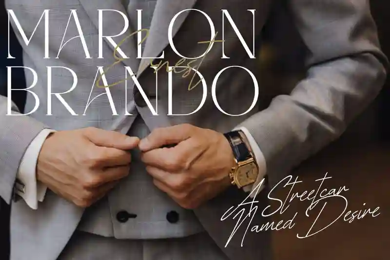
Is your website playful and youthful? A handwritten script paired with a geometric sans-serif could do the trick. For a professional brand, a classic serif and a modern sans-serif might strike the perfect balance.
Stick to a Family
Sometimes, less is more. Choosing fonts from the same family often ensures harmony, especially when using different weights for headings and body text.
Size Matters IN Font Pairing
Think about hierarchy. Headlines need to be bigger and bolder to grab attention, while body text should be smaller and easier to read.
Don’t Forget Color
Type doesn’t exist in a vacuum. Consider the background color and overall design scheme when choosing your fonts. High-contrast pairs like black and white can be striking, while similar color palettes might call for subtler pairings.
Online Resources are Your Friend
Feeling overwhelmed? Websites like Canva, Fontpair, and Google Fonts offer curated pairings and allow you to experiment before committing.
Remember, font pairing is an art, not a science. Experiment, have fun, and trust your eye. By following these tips and letting your creativity flow, you’ll find the perfect pairings that make your message sing. Here’s a very interesting article about typography and font pairing at Adobe.
Bonus Tip: Break the rules! Once you understand the basics, feel free to experiment with unexpected combinations. Sometimes, the most beautiful harmony comes from breaking the mold.
Now go forth and design! Let your fonts become instruments of visual storytelling, captivating your audience and elevating your message to new heights.
Some Amazing Elegant Font Pairings are Here:

California Dreaming
Script & Sans
A perfectly-paired, hand-drawn font duo, boasting a classic sans serif in 4 versions, including an SVG

ADVERA || font duo
Introducing ADVERA Font Duo: An elegant serif typeface combined with signature script.

Intimate Summer Font Duo
Introducing Intimate Summer Font Duo, featuring a strong and bold sans font alongside a casual handwriting-inspired script font.
House of Montague
Duo-Font
House of Montague is a traditional font for the classic serif type with the addition of a script type.

Travel Poster Font Duo
Travel Poster is a font duo with a monoline Script with a small x-height and a bulky vernacular Sans